Charts
Display the beautiful charts inside the conversational UI.
Example
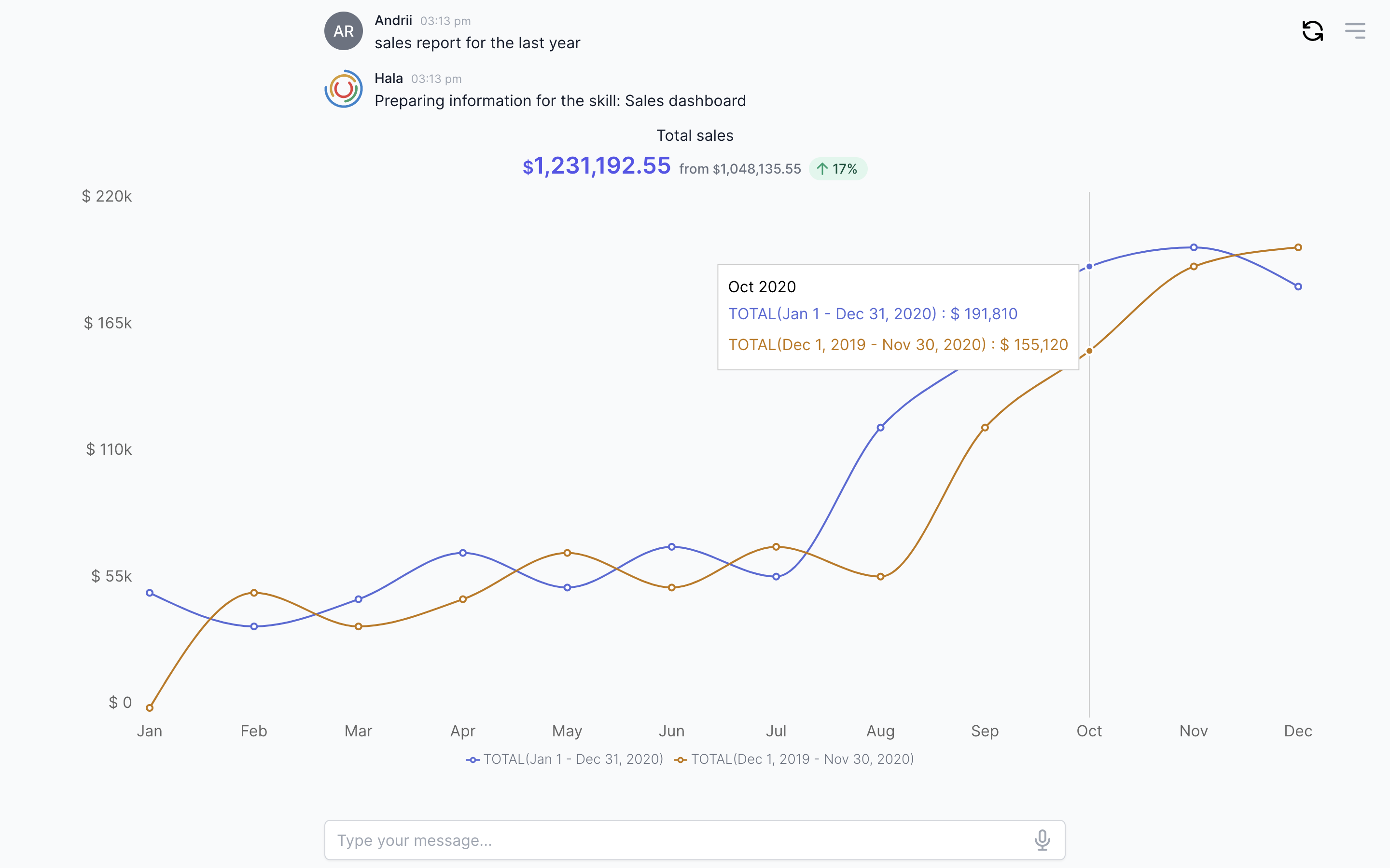
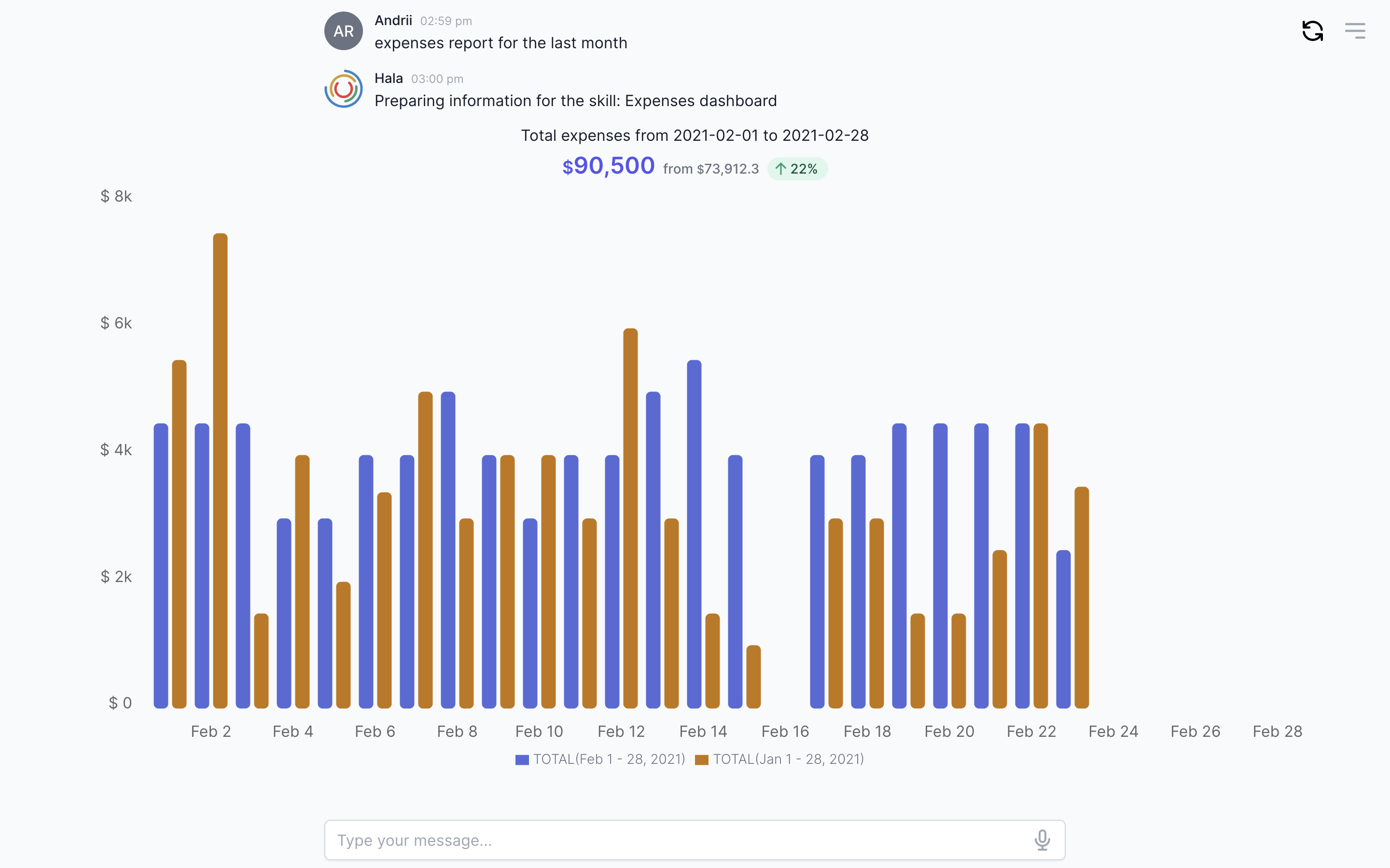
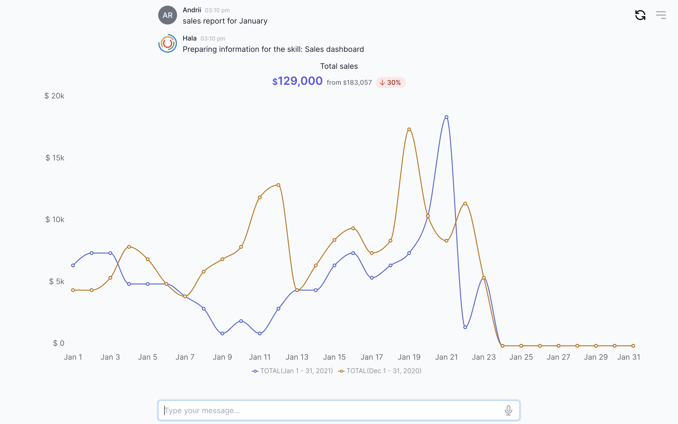
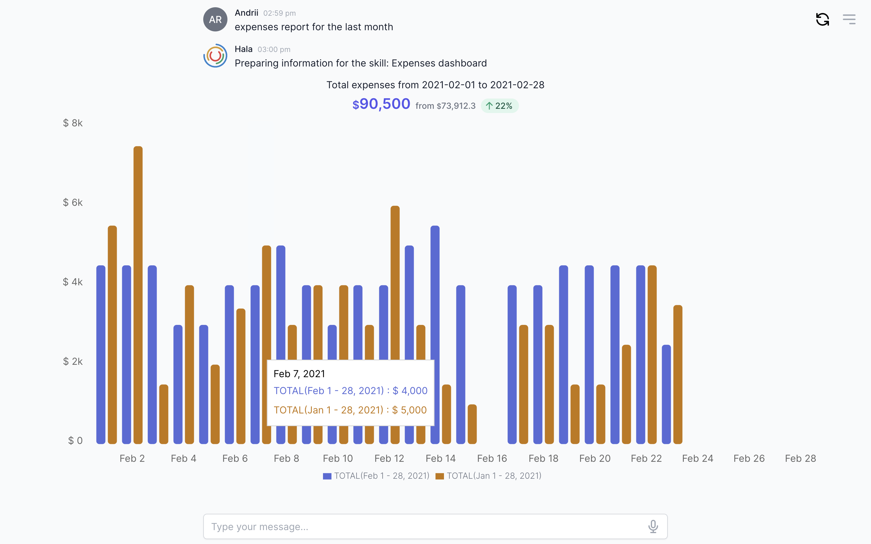
Here’s an example of a chart component.

Why to use?
The chart component allows us to display the analytics to the users inside the conversational chat. You can display revenue, expenses, sales by-products, growth, profit and loss statement, and other information with a chart component.
The conversational AI technologies allow us to combine the BI capabilities and machine learning technologies (natural language processing) in one interface, in one place.
Guidance
Add heading of the chart
Add heading information for your chart to let users know what they see on the screen. Also, you can add the dates to emphasize the period for the generated chart.
Add total values
We found that apart from the chart, users want to see the total values. This is important, for example, when you display sales or expenses data.
Define periods to display
When you display the information for the 12 months or a quarter, you do not need to display each date because the chart will look ugly with 365 data points.
We ruled that if we have less than 40 data points, we display them one by one, one data point equal one day. If more than we group them to weeks or months or quarters.
Design the value labels
You can decide do you want to display the values for each data point or not. You can hide them, and if the user moves to it, the user will see the helper with the values.
Add legend
In our example, we have two periods to compare. In that case, we need to add the legend with an explanation for each period.
How to use
You can find more information about using this component here.
Next sections to read
