Dashboards
With Dashboards, you can combine many UI components (e.g., charts, tables, stats) into one place.
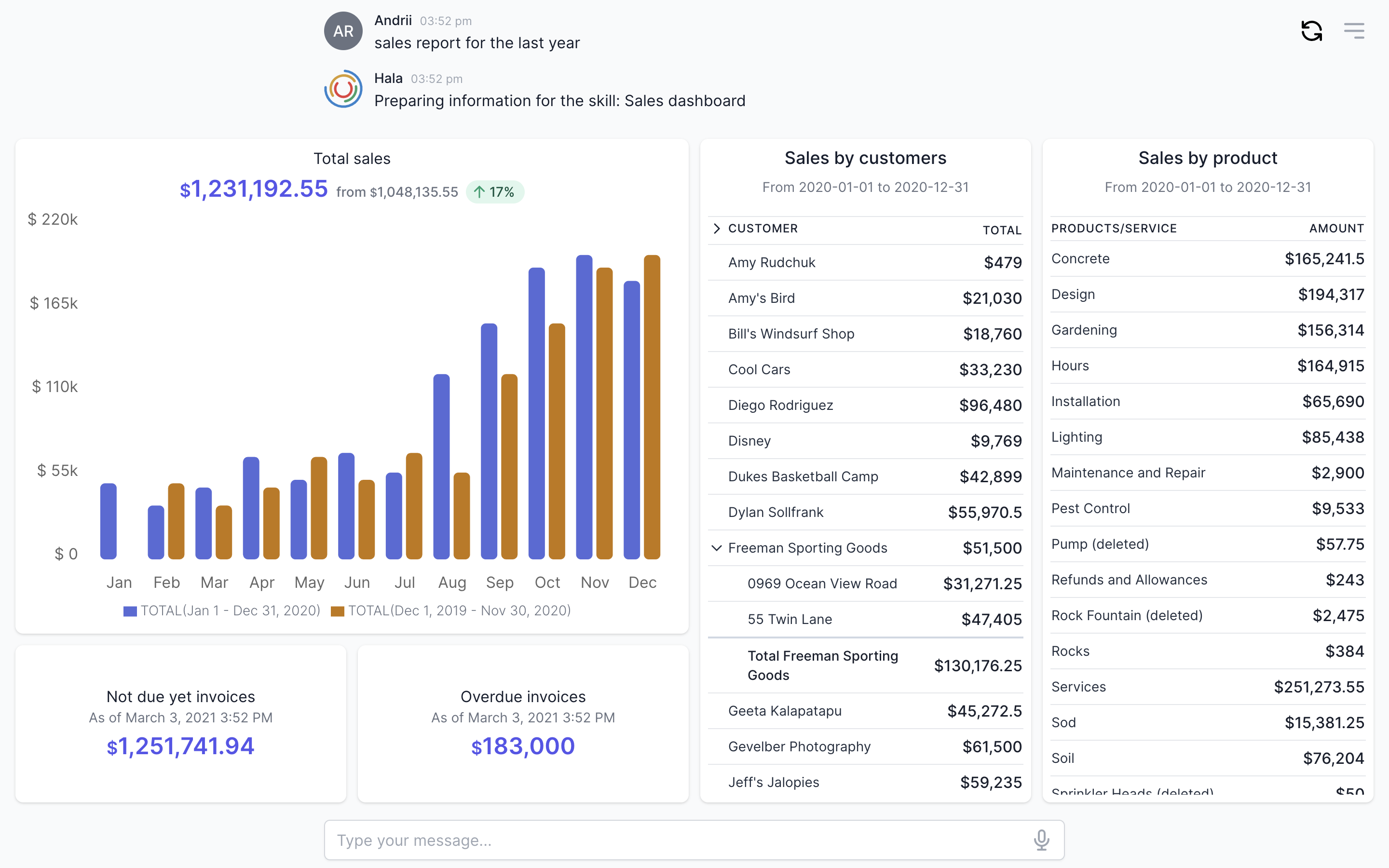
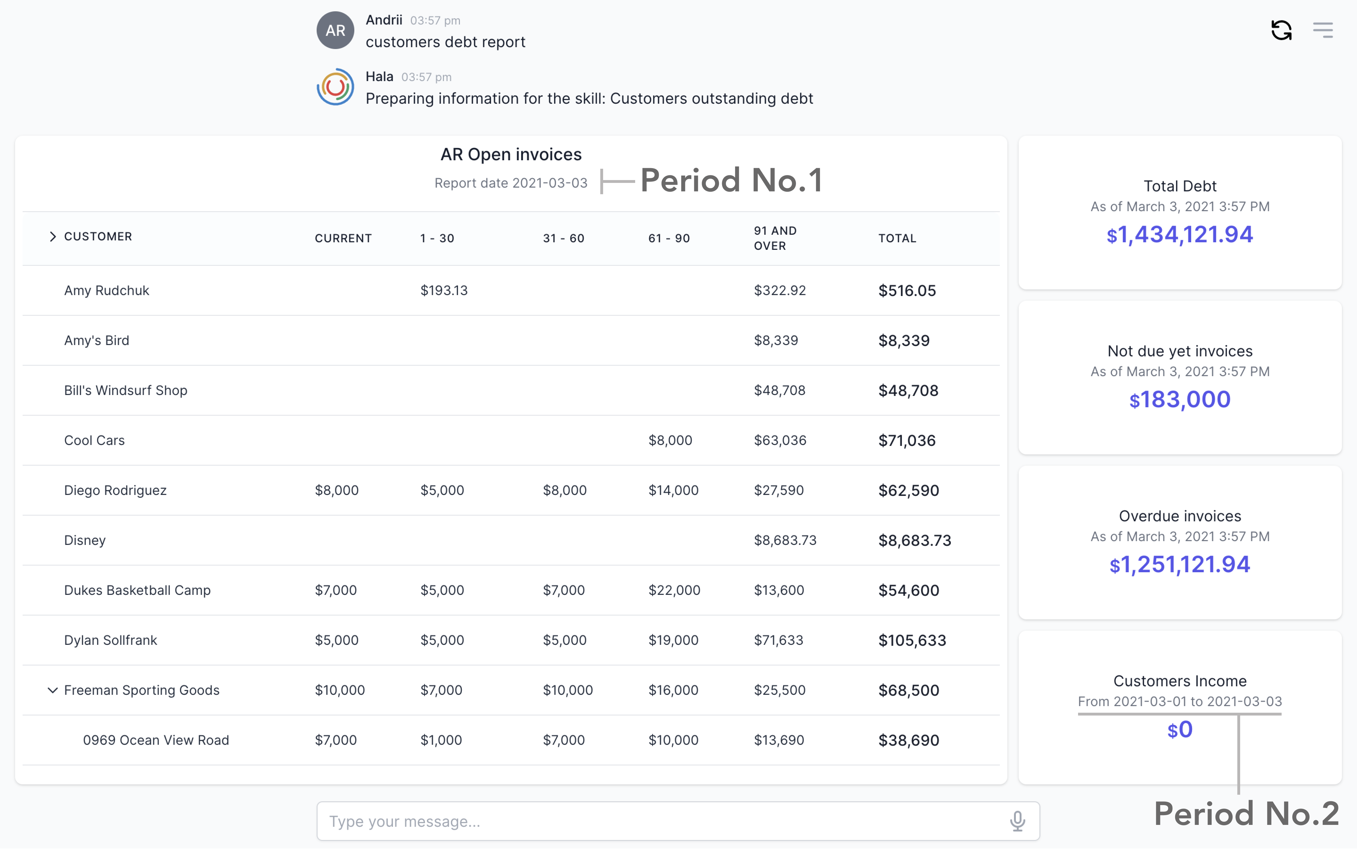
Example
Here’s an example of a dashboard component.
Why to use?
We found that dashboards one of the powerful components to use in Watson assistant UI.
With dashboards, you can combine several UI components in one place. For example, you would like to display information from many sources and which is covering different areas.
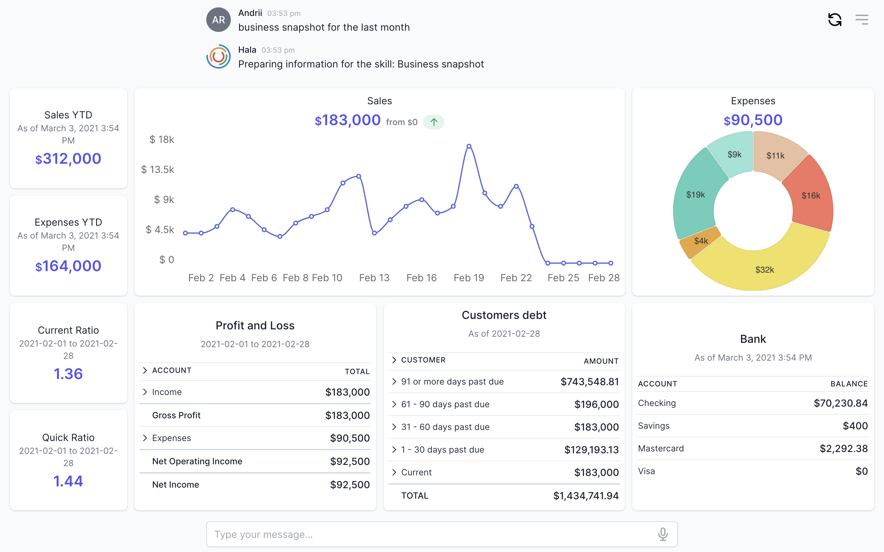
A good example to explain the usages of the dashboards is a business snapshot. When users want to see the business snapshot, in many cases, they would like to get the next information:
- Sales & Expenses YTD (UI component - stats);
- Financial ratios (UI component - stats);
- Sales overview by day (UI component - charts);
- Expenses by cost elements (UI component - charts);
- Profit and loss statement (UI component - lists);
- Customers debt (UI component - lists);
- Bank accounts (UI component - lists);
We can combine all the above information into one Dashboard and make it available in Watson assistant UI. Dashboards are working like Lego, each block is a separate UI component, and you can use those blocks to build the dashboard.
Guidance
Make the dashboards simple
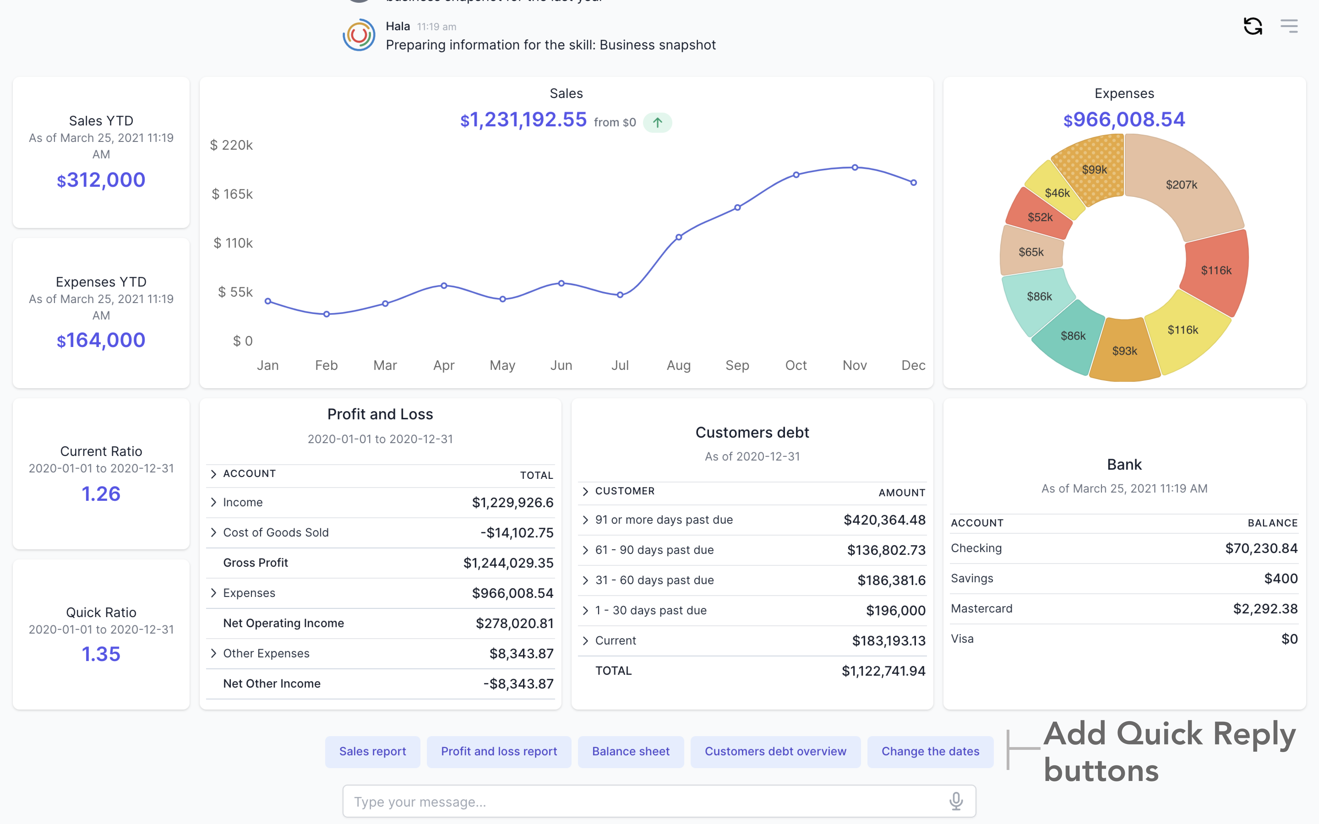
Add no more than 10 blocks into the dashboard. Of course, this would depend on the dashboard's content and the components that you are going to use. Users would probably like to see everything in one place, but this could overcomplicate the dashboard. It would help if you tried to keep the dashboards simple.
Cover the needs of the users
If users would like to see more information in one Dashboard and during the dashboard design, you found that it is overcomplicated, then it is better to use Quick Reply buttons and develop new dashboards with new flows.
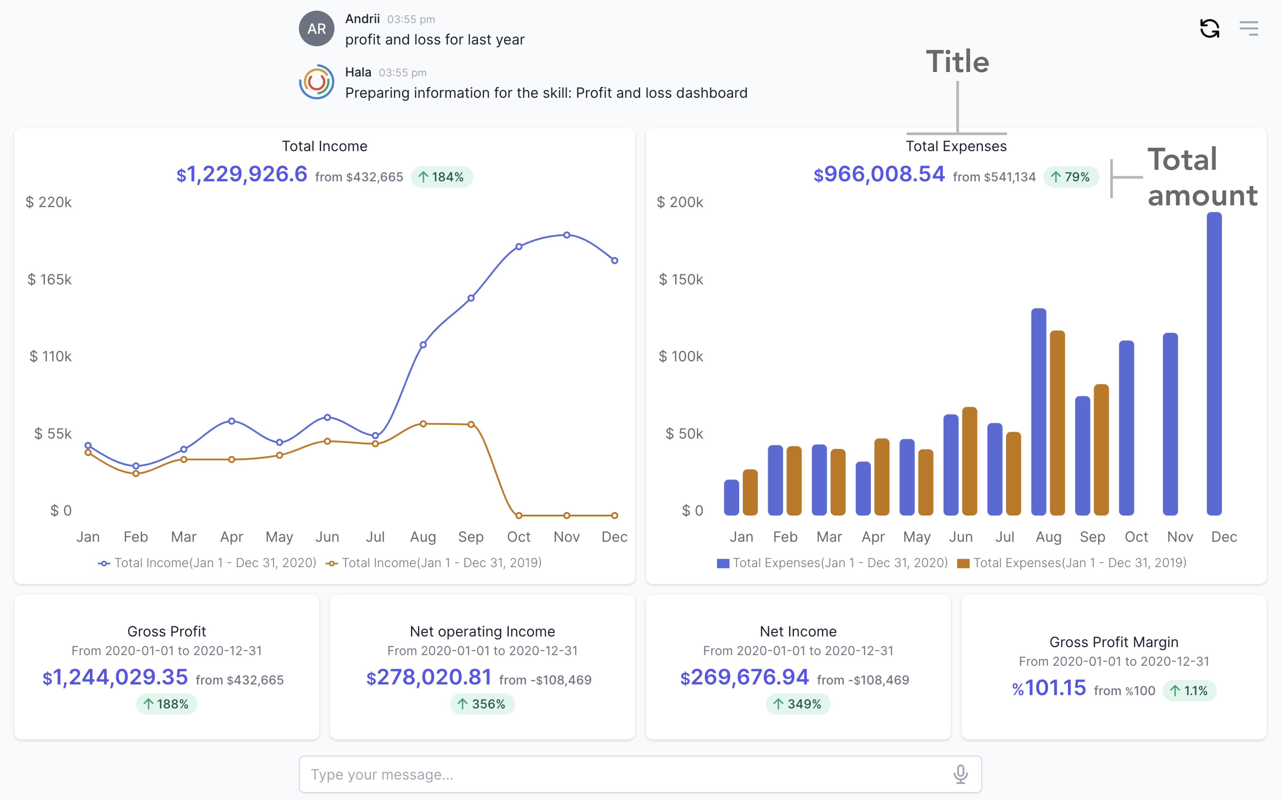
Add titles
When you display charts with the information by periods (day, week, month), please add the title and the total information. Sometimes the dashboards are displayed without specifying the total values (plus a comparison of total values with previous periods). Still, it is an essential part of each block to have at least a title.
Add data labels
If your dashboard includes the data generated for different periods, it is essential to provide it to the user opportunity to understand for which period the data was generated. Each block should include information about the dates even if you have even one block lying data that varies from the requested period. For example, if users want to see the customers' debt, you can prepare the dashboard to display this information, but one of your blocks can display not the customers' debt but the sales for the current month, so in that case, we need to display the dates.
How to use
You can find more information about using this component here.